E-Commerce
Landing Page,
landing pages decoded.
A practice project I set myself to understand how landing pages work. I followed a YouTube tutorial on landing page design, then rebuilt the concept in Figma to learn how hero sections, product grids and buy-now prompts hold attention.
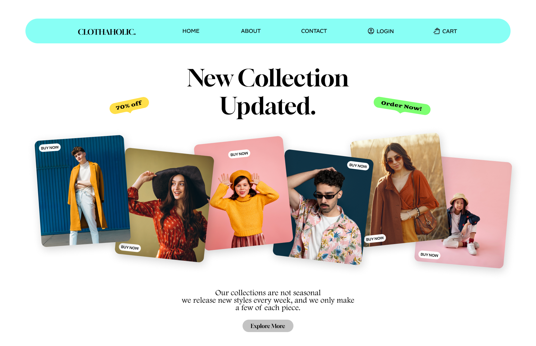
The complete scroll — hero headline, promotional badges, staggered product cards and a closing statement with an explore button.
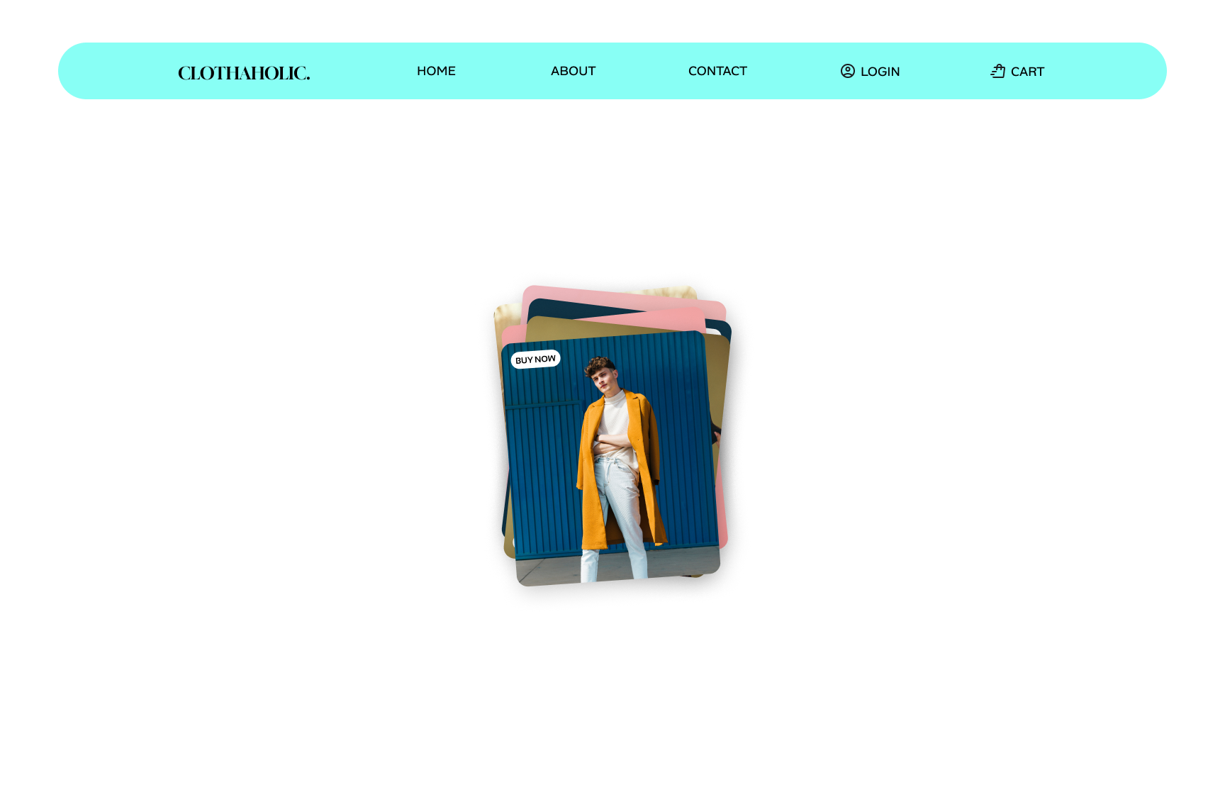
A closer look at the layered product card treatment: overlapping corners, bold color blocks and a persistent 'Buy Now' call to action.
What I was practising
I started by studying the anatomy of a landing page: a headline that explains the offer, a hero image that proves it, product cards that create desire, and a final call to action that removes friction.
Each product card uses a different background color and a slight rotation to break the grid without losing rhythm. The "Buy Now" buttons and promotional badges repeat across the page so the user always knows what to do next.
Prototyping the page in Figma taught me how spacing, alignment and repeated microcopy work together to move someone from curiosity to a click — even when the click is just part of a practice file.