Grocery shopping,
made effortless.
This project was originally built as the capstone assignment for the Microsoft UX Design Professional Certificate in 2025. I earned the certificate after submission, and the work below shows the end-to-end Figma prototype that carried it through.

Earned after submission.
This grocery app was the capstone I submitted for the Microsoft UX Design Professional Certificate on Coursera. The program covered the full UX process — from research and wireframing to prototyping, visual design, accessibility, and collaboration.
- Fundamentals of UI/UX Design
- Designing for User Experience
- User Interface Design and Prototyping
- UX Design in Practice: Accessibility and Collaboration
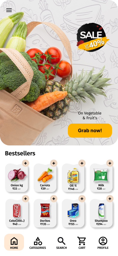
A produce-led hero, a running offer, and bestsellers you can add without leaving the shelf.
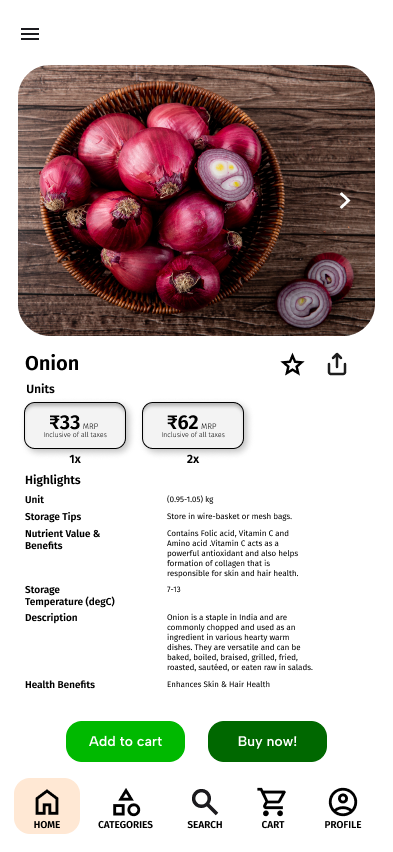
Units priced side by side, then the details people actually check — storage, nutrition, benefits.
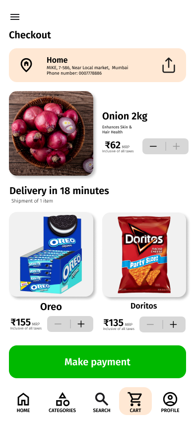
Address up top, order below, delivery time in plain words, and one green button to finish.
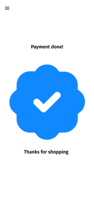
One confirmation moment. No upsell, no clutter — just a thank you and a clear way back.
Design notes
Groceries are a repeat purchase, so the app is built for speed over discovery. Every bestseller carries an add button on the tile, the bottom bar never moves, and the cart is always one tap away.
Pricing is the honest part of the interface. Units sit next to each other as cards so a 1x and a 2x choice reads as a decision, not fine print — with inclusive-of-tax stated instead of implied.
The palette borrows from the produce itself: fresh greens for action, a soft peach for surfaces, and photography doing the heavy lifting so the chrome can stay quiet.